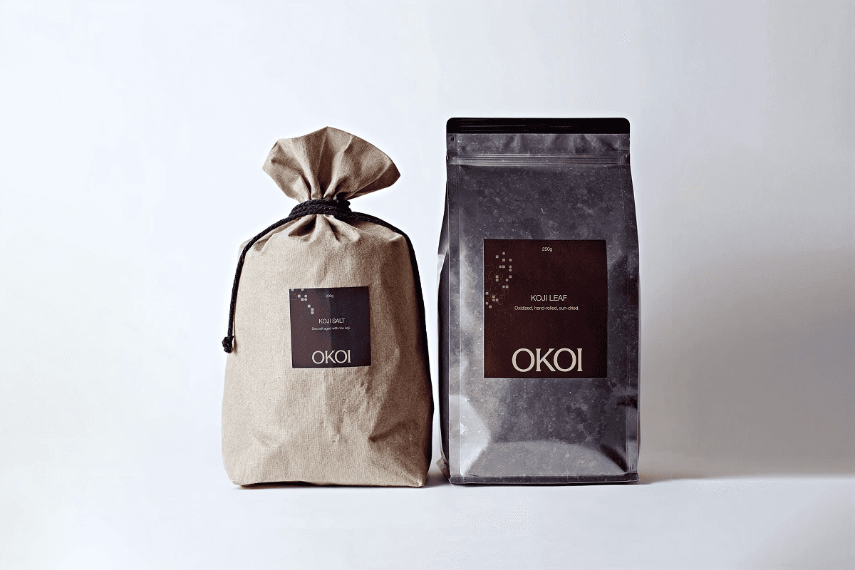
OKOI is a fermented bar and select shop built around the slow philosophy of organic transformation. Taste, material, and design coexist here without hierarchy. SHIO developed the complete brand world, translating the temporal logic of fermentation into a visual system that balances structural clarity with raw human warmth. From the naming of products to the architecture of the menu, every decision carries the same underlying logic: things that change over time are worth paying attention to.
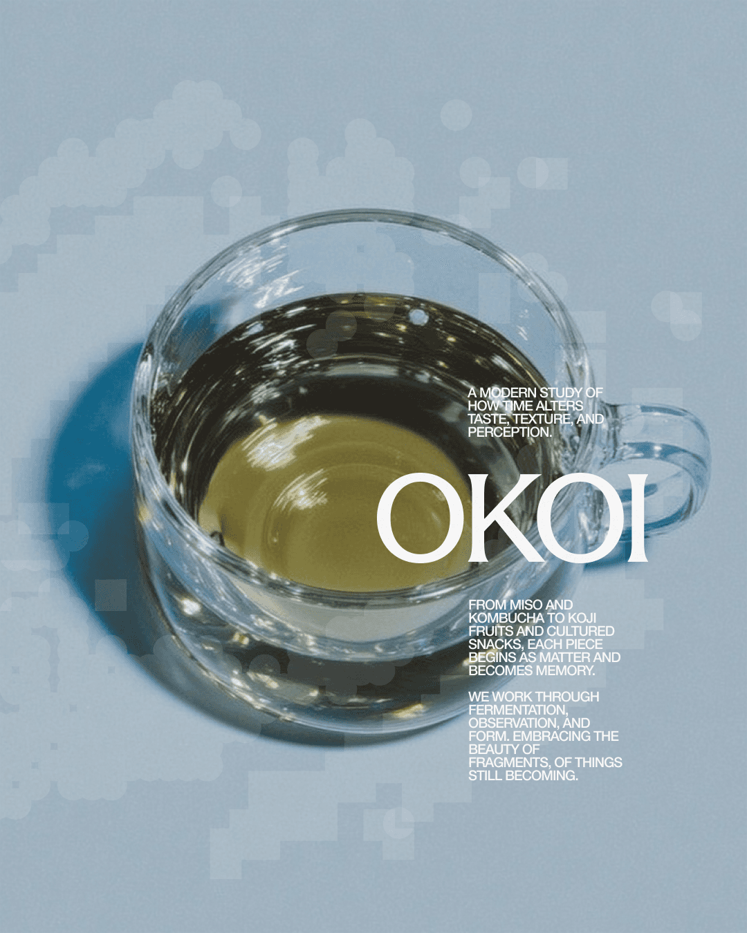

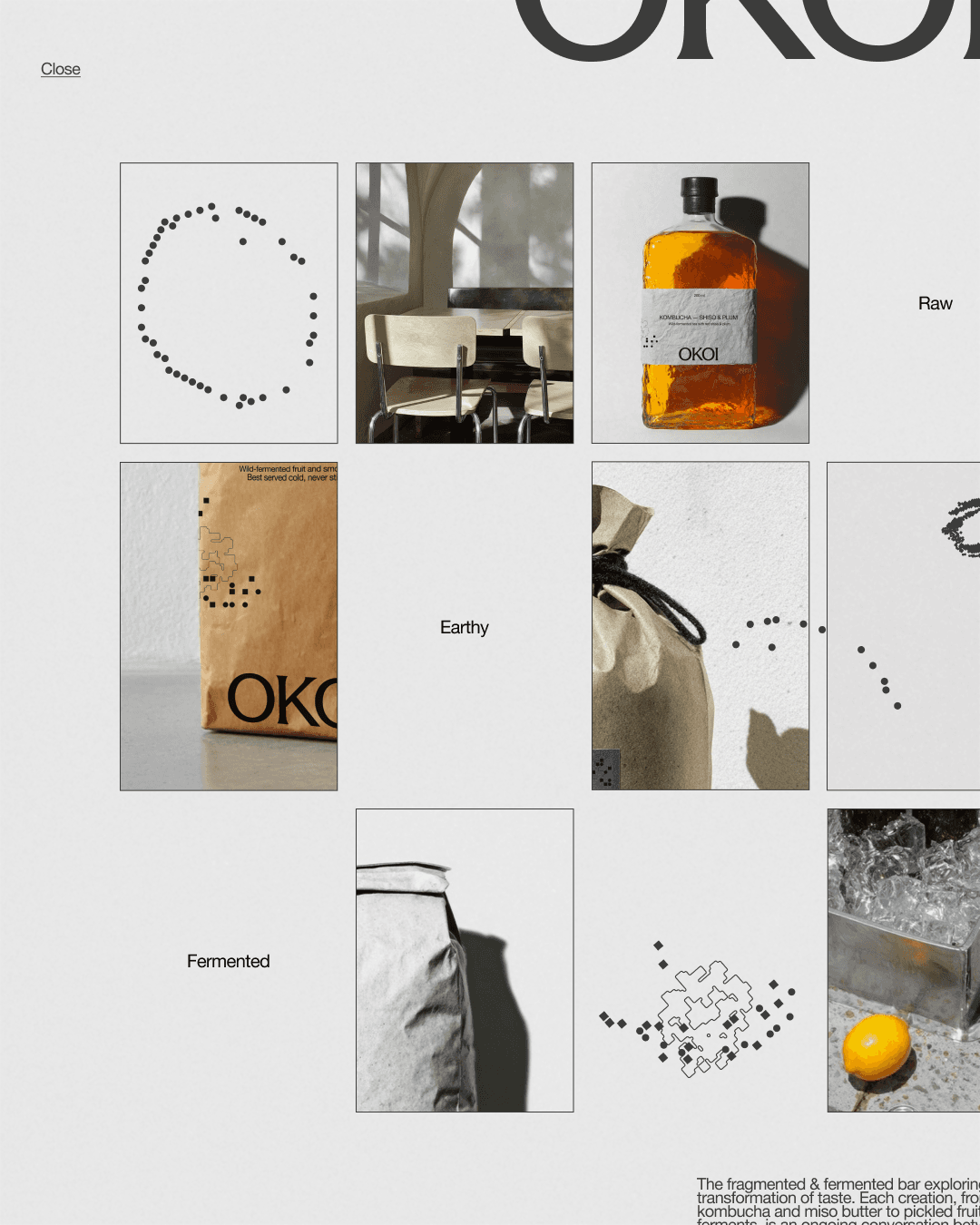
The identity runs on two marks. The wordmark is wide, clean, and undecorated. A stable anchor for a brand built on instability. The secondary mark is a pixel organic circular form, dots arranged in an incomplete ring that shifts and fragments across applications, mimicking microbial growth and fermentation culture. It never fully closes.
The packaging uses two distinct material languages: kraft cloth drawstring bags for dry goods, matte sealed bags for cultured products, each carrying small dark label patches with precise, almost scientific product descriptors.
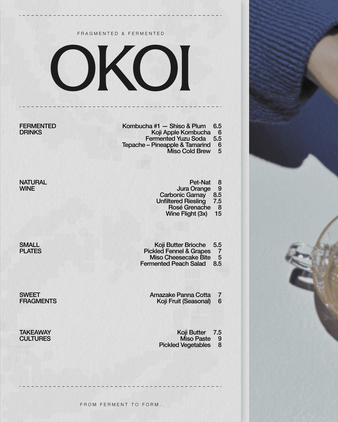
The menu extends this thinking into language. Categories named Sweet Fragments and Takeaway Cultures, a closing line that reads From ferment to form. Art direction captures unposed, intentional moments: hands reaching across a counter, light bending through glass. Precision and imperfection in the same frame.

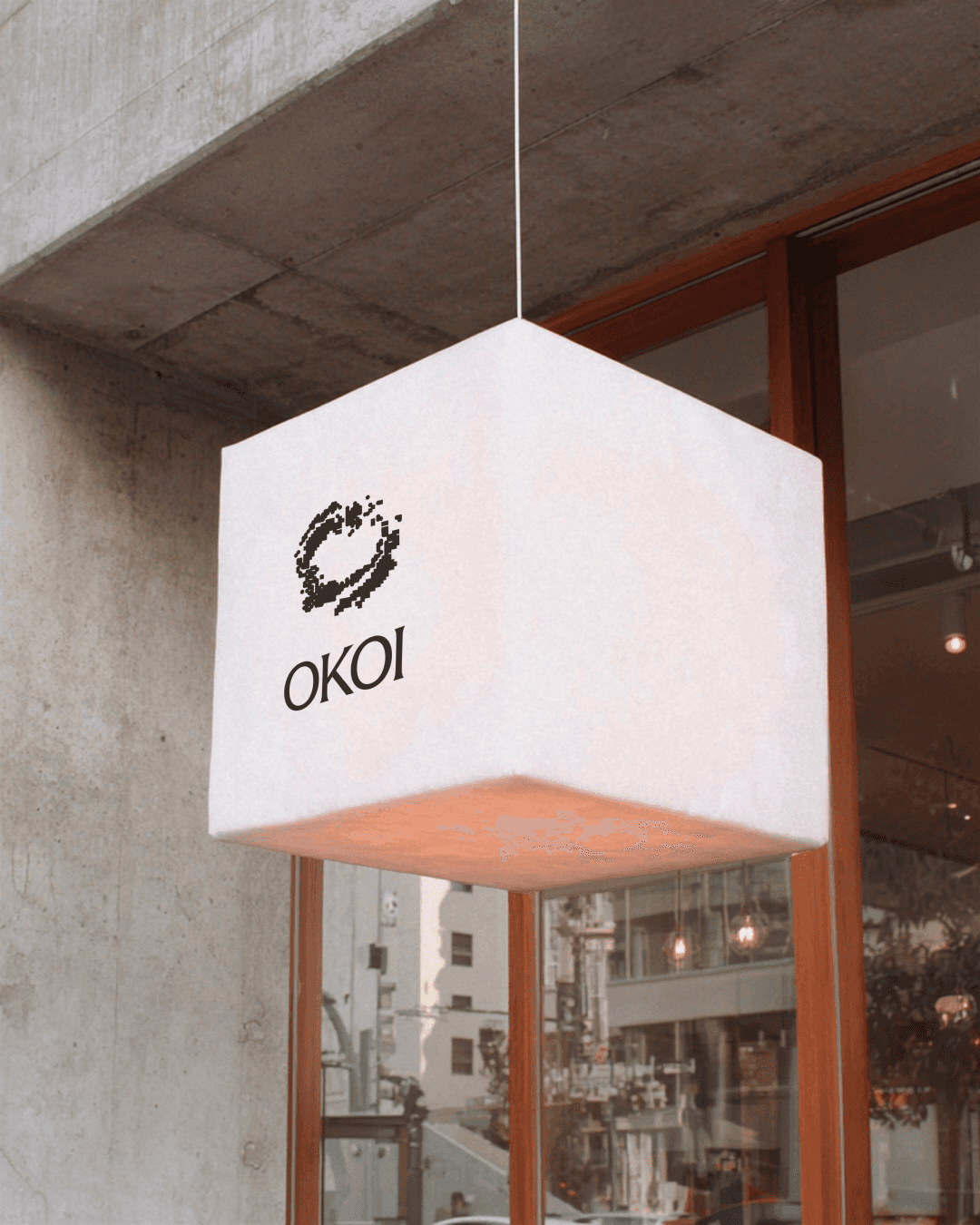
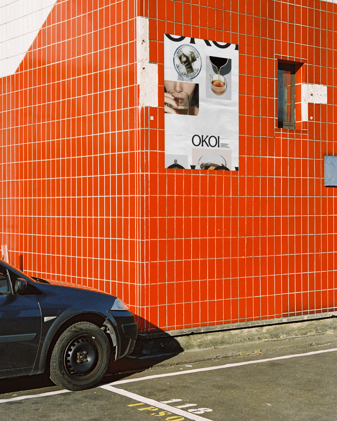
Art direction is intimate and slightly grainy. Liquid in motion, hands on vessels, concrete surfaces, amber light through glass. The digital platform carries the same unhurried logic, pixel organic motifs drifting across pages alongside product photography tagged Raw, Earthy, Fermented. It bypasses retail conventions entirely. More like an act of observation than a place to shop.





( Other works )

