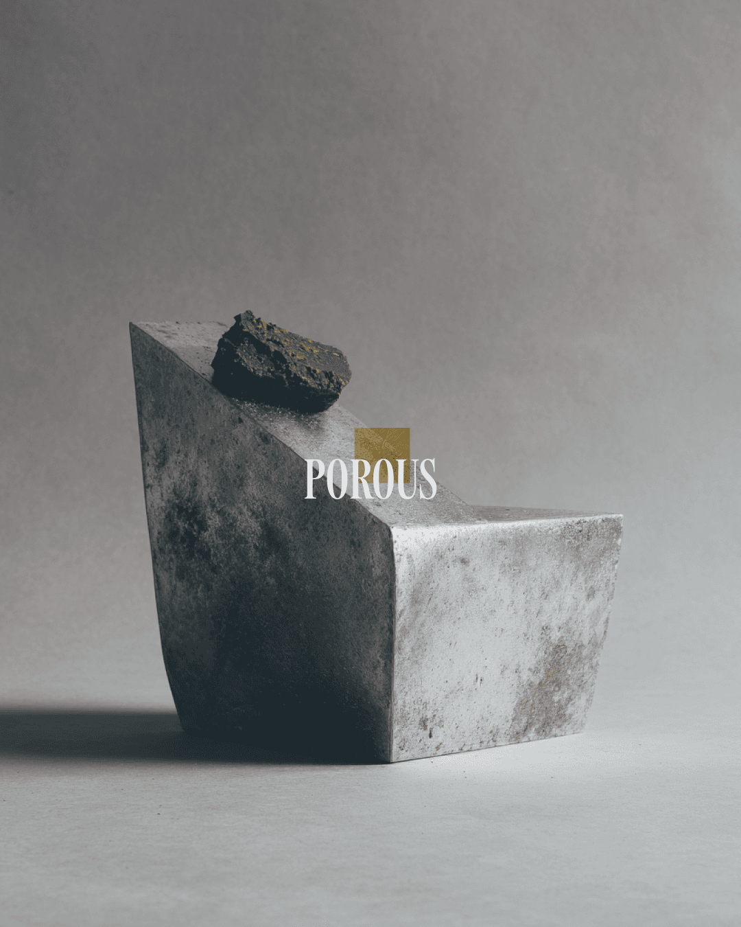
Porous is a premium chocolate house based in Paris, built closer to fashion than food. SHIO was commissioned to construct a complete brand experience across identity, packaging, campaign direction, and digital presence, positioning Porous as both an indulgence and a philosophy.


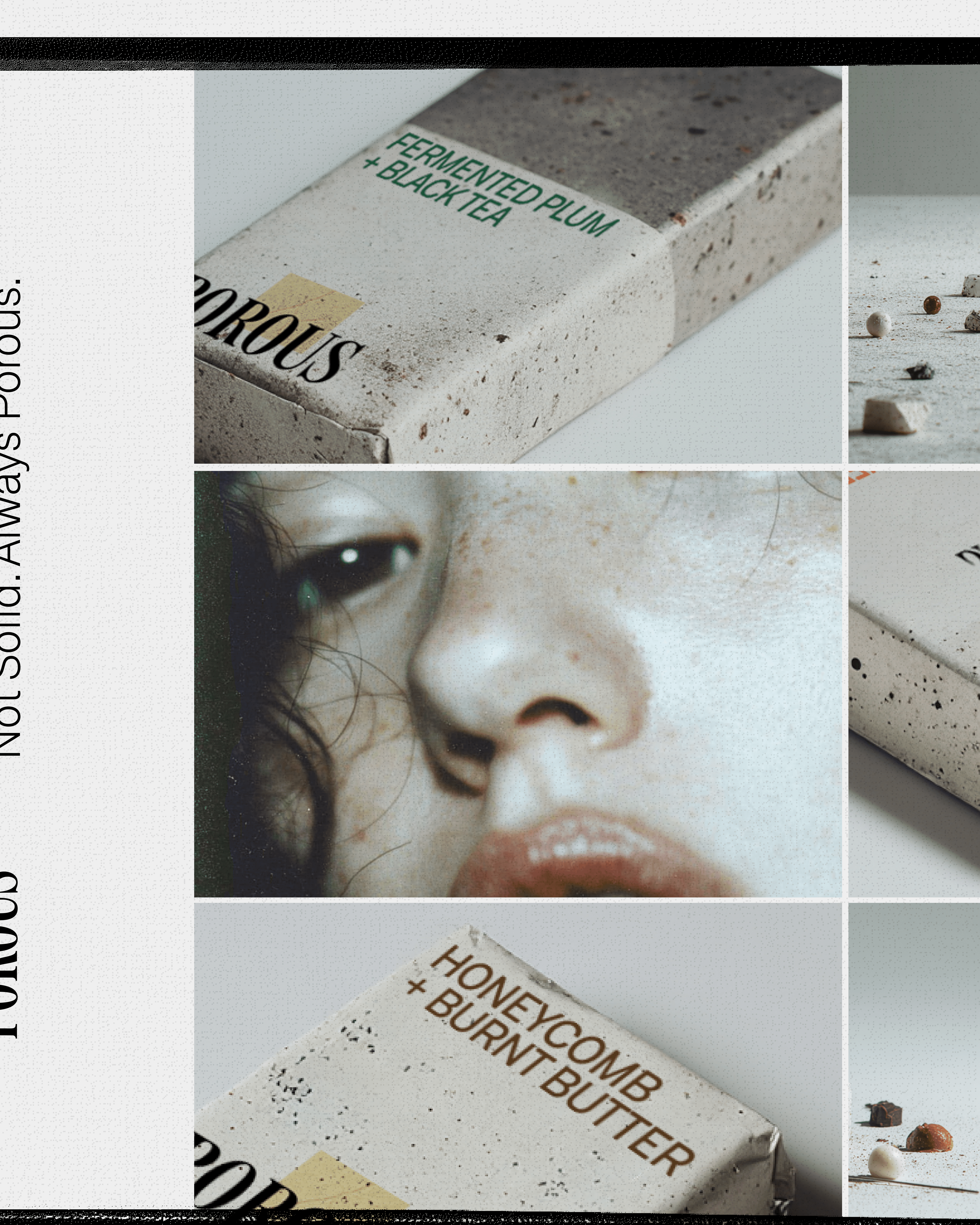
Packaging is concrete textured, mineral, almost geological. You'd pick it up expecting it to be heavy. Flavour names printed in dark green against the rough surface: Fermented Plum and Black Tea. Smoked Cacao. The naming is as considered as the material.
The logotype is a high-contrast serif anchored by a small gold square, luxury and rawness held in the same mark. Campaign copy follows the same logic. Not Solid. Always Porous. Every fracture carries a different path. Every melt leaves its own imprint.
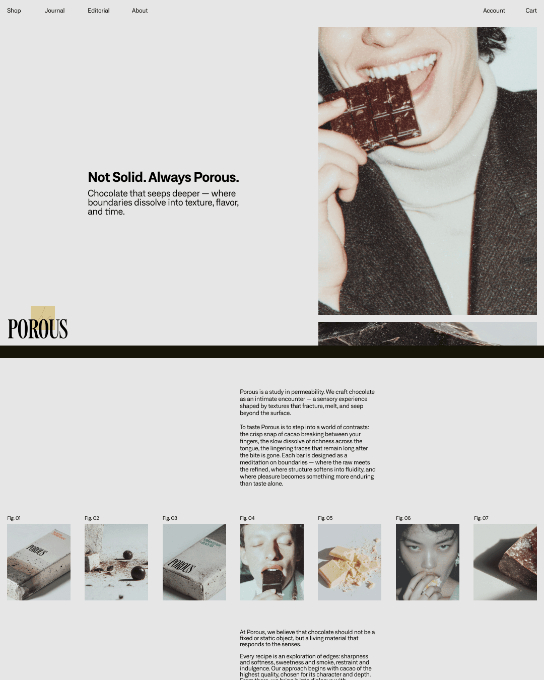
The art direction runs on intensity rather than elegance: a model biting chocolate in a Paris Metro station, sweetness made confrontational. Typography fragments across the layout, words like Softness and Tension set vertically in large type, columns running simultaneously in multiple directions. The page performs the brand name. Things seeping through boundaries.


The digital world treats each product as an exhibit. Fig. 01, Fig. 02, a numbered archive that slows the experience down and makes looking feel deliberate. The interface doesn't sell the chocolate. It makes you want to understand it.

( Other works )