
Void Haus is an independent publication at the intersection of subculture, identity, and visual expression. SHIO constructed the brand identity and visual system to move between printed matter and digital environments without losing its edge, building a world that celebrates the avant-garde without romanticizing it.

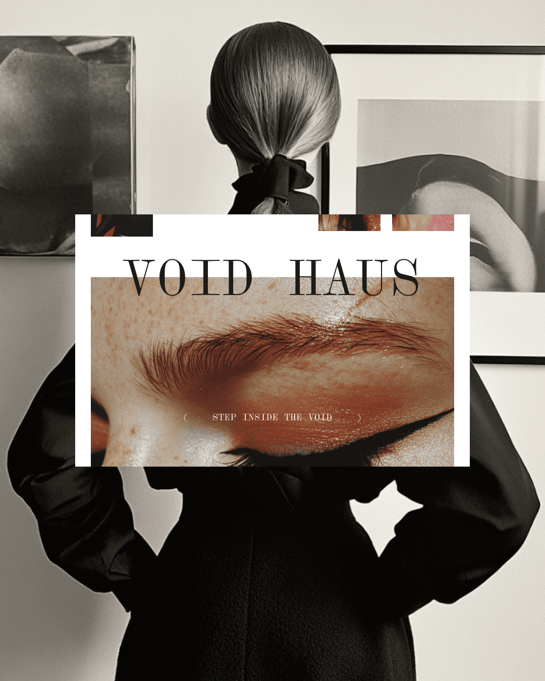
The hero photography is motion blurred, figures in elaborate structured garments caught mid movement, never fully resolved. Polaroid style stacked portraits alongside: extreme close ups of eyes, skin, lips. Raw and intimate.
The logotype is a wide high-contrast serif with deliberately generous letter spacing, the void literally built into the name. Applied in acid green against black in campaign imagery, white in editorial spreads.
The magazine interior uses a clean editorial grid with wide margins and precise typographic hierarchy. Small decisions that signal a publication that takes itself seriously.

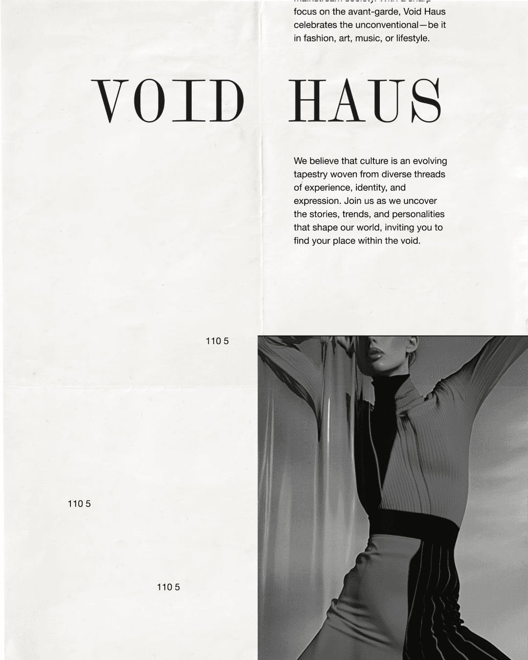
The digital presence mirrors the depth of the printed page. Clinical, direct, structurally rhythmic. Built to document subculture with the seriousness it deserves. A cultural document, not a content platform.
( Other works )


