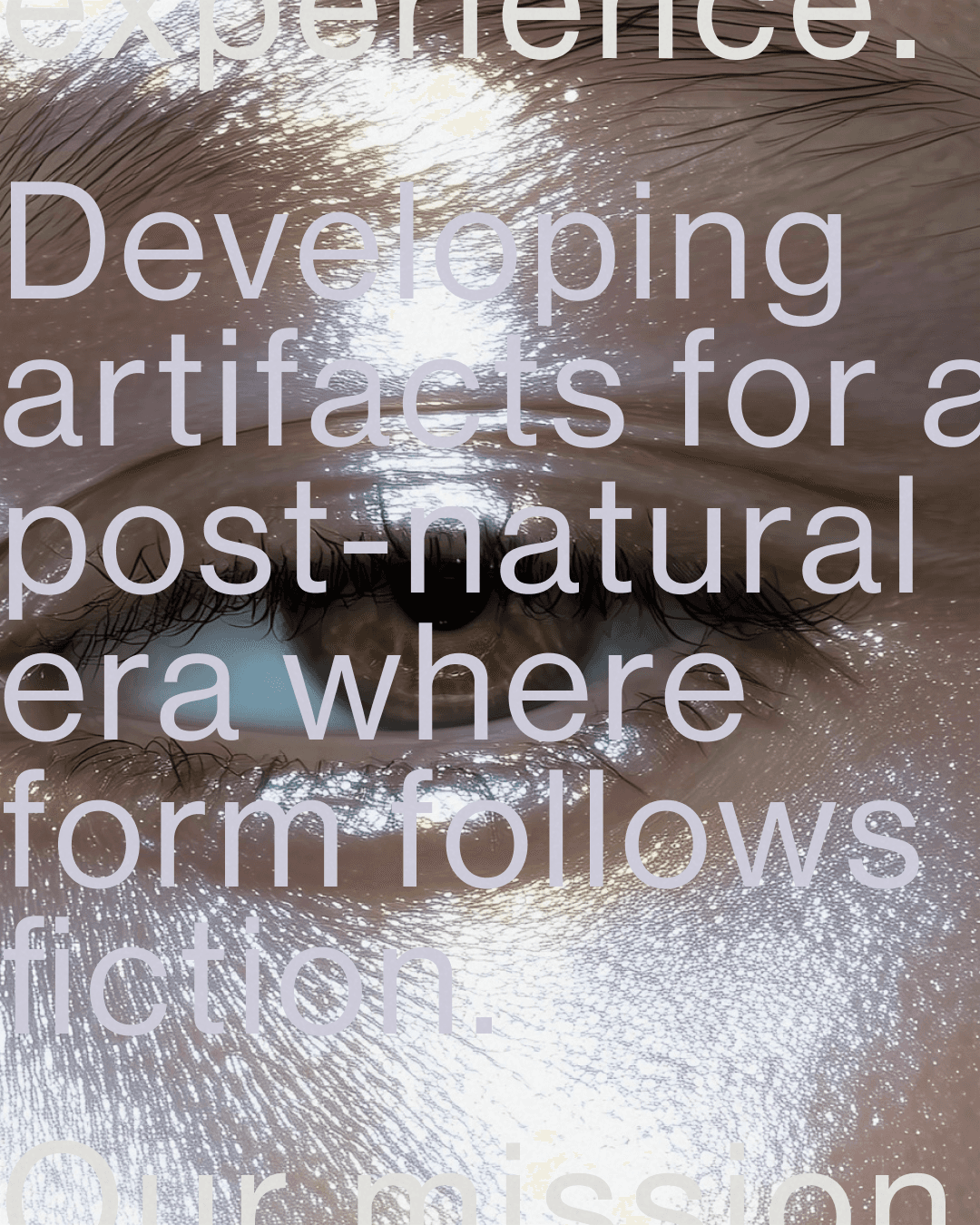
.non is an exploration of functional surrealism and the geometry of ritual. Moving away from wellness conventions, the brand positions itself at the intersection of high fashion, industrial design, and post-natural form. The core identity re-codes organic archetypes, the curve of an egg, the jaggedness of raw stone, into high-tactile sculptural artifacts. Products are named like scientific protocols. Packaging is catalogued like specimens. The everyday ritual gets a completely different set of rules.
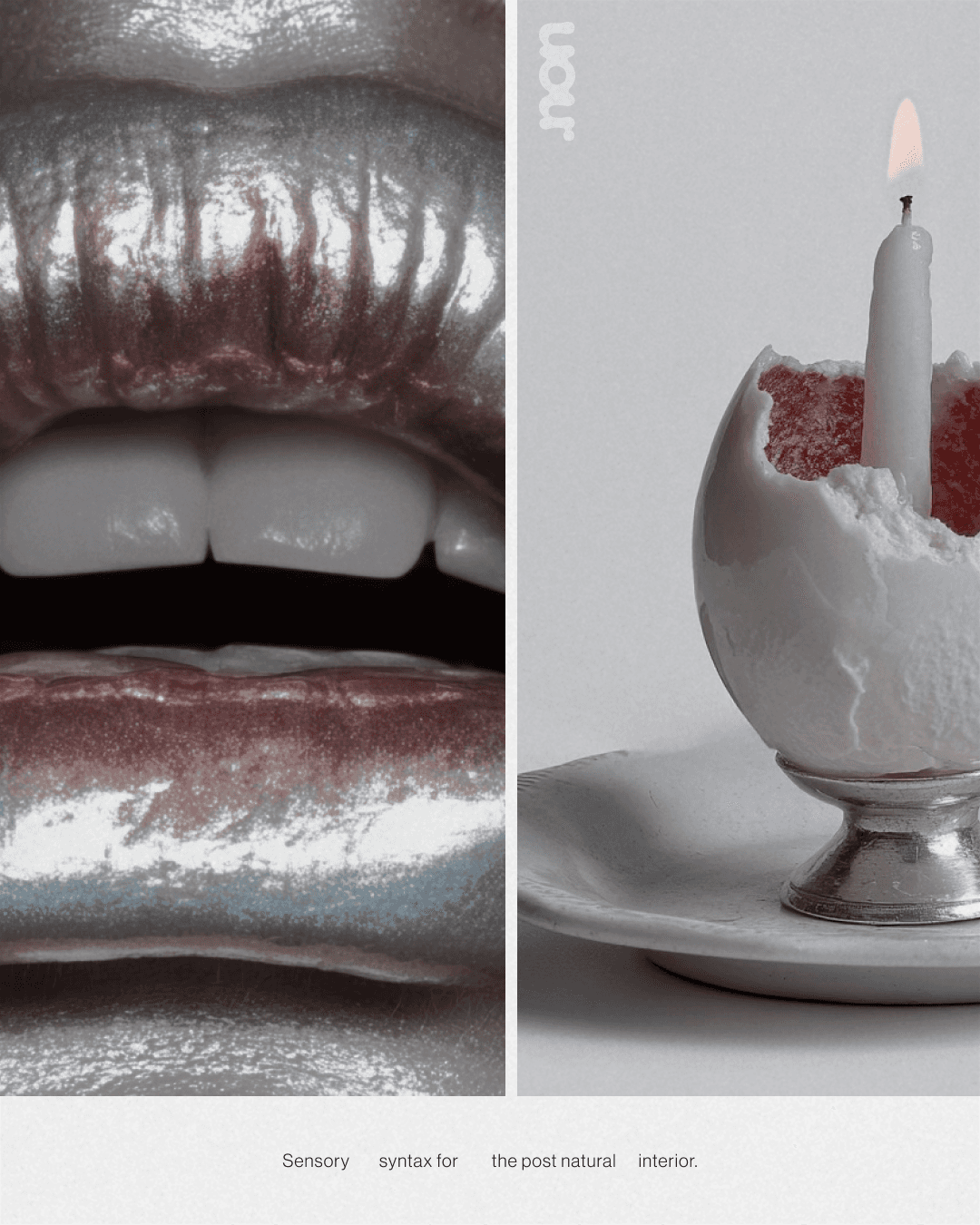
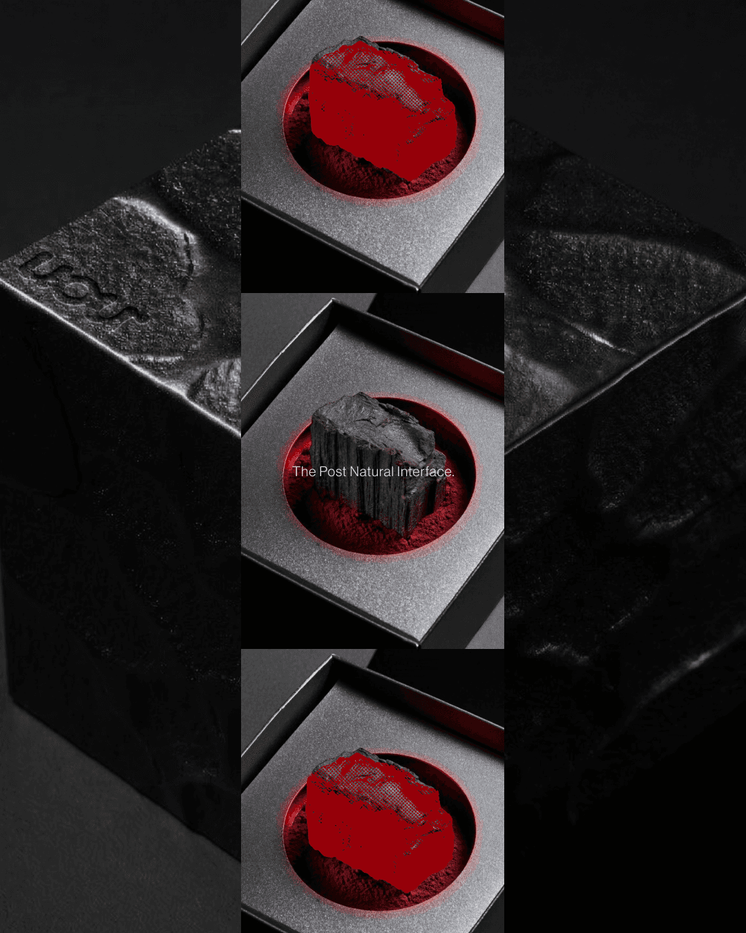
Packaging uses blind embossing rather than print. The logo is a tactile imprint, felt before it's seen. Silver matchboxes, grey foam lined cases, debossed copy running along the edge. Surrealism for the everyday ritual.
The logotype is fluid and almost biological, letterforms mid-transformation, neither fully solid nor fully dissolved. Applied directly onto skin in campaign imagery, the mark inhabits the body rather than sitting above it.
The art direction moves between extreme close up and clinical distance, deep crimson mineral baths against matte black and sterile grey. Bodily and cold at the same time.

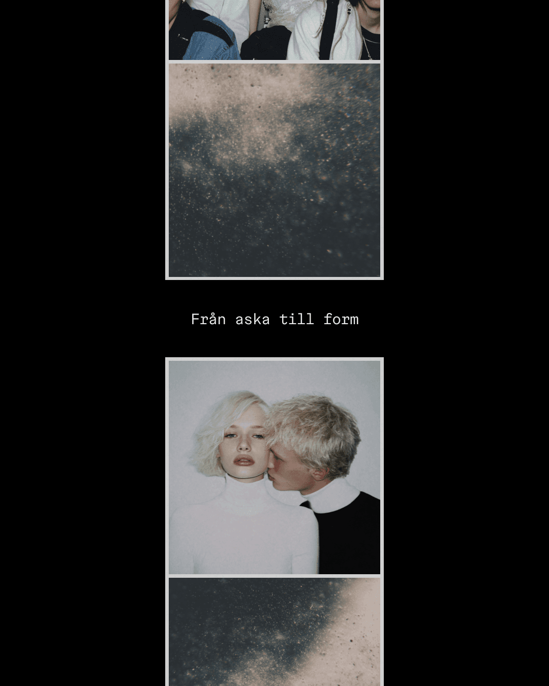

The digital world extends the brand into architectural scale. OOH tunnels, rotating 3D brand objects, motion sequences that create friction between the physical artifact and its screen representation. A daily habit, pulled into a completely different register. Not wellness. Something stranger and more considered.

( Other works )